Office Revolution held an internal design competition, challenging our designers to reimagine our headquarters’ office. As the business has expanded over the years, our workplace needs have evolved. Since the pandemic, we’ve shifted to a hybrid work schedule, opened new locations, expanded our staff, and embraced new technologies that have enhanced our digital services. This growth highlighted the need for an office refresh to better support a larger, hybrid workforce and prioritize spaces for virtual collaboration, reducing the emphasis on assigned desks and private offices.
Office refreshes are an excellent option for anyone with an existing space that could use some improvements. We suggest office refreshes to many of our own clients: an “office refresh” updates a space without a full renovation, focusing on improving its look, feel, and functionality with minimal disruption and a smaller budget. It targets key areas that impact employee morale, productivity, and aesthetics, such as collaboration areas and social hubs, prioritizing those over a complete overhaul of the whole office. Furniture, acoustics, technology, and even accessories are all key elements of a refresh that contribute to a more inviting and functional space.
As a leader in office design and renovation, Office Revolution leveraged our extensive in-house expertise for our office refresh. To engage end users and build excitement, we held a design competition among our team, allowing them to create the vision for our refreshed space.
The instructions for the contest were to “incorporate current floor plate trends and research to support an incredible employee experience in our Chicago Showroom.”
The goals assigned to contestants were to incorporate modern trends, enhance employee experience, re-use existing products where possible, and prioritize our main manufacturing and rep partners (Teknion, OFS, Humanscale, Custom Crafters, the Senator Group, and Level Reps) for new product selections.
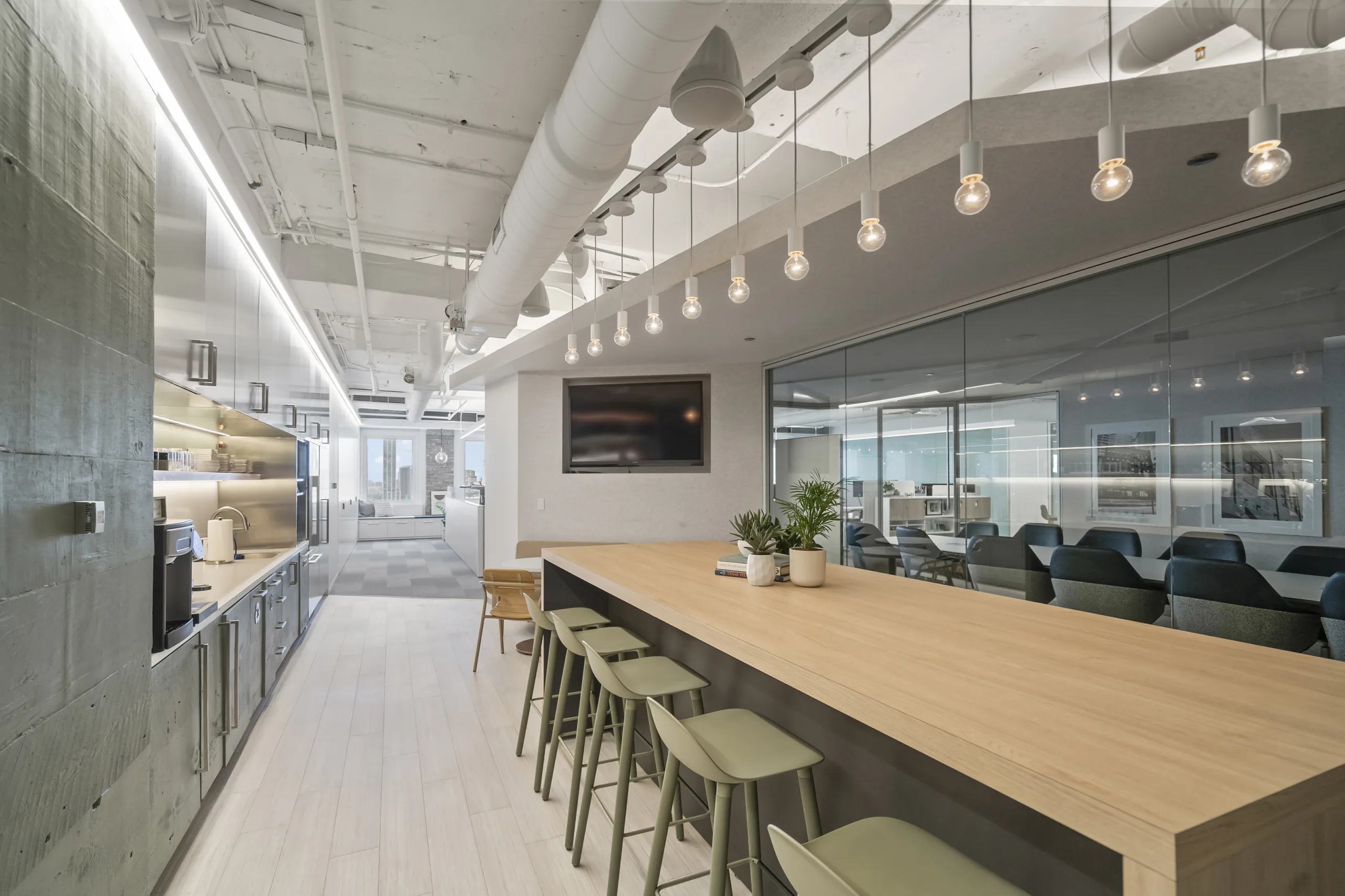
Alyssa Ludwig and Abby Boeheim emerged as the winning team, showcasing their impressive track record of stunning projects. Drawing on their extensive expertise in human-centered design, they developed a beautiful, research-driven concept for their contest entry.
Abby, a certified WELL AP and Senior Designer, has been with Office Revolution for over 14 years, executing projects for high-profile clients like McDonald’s, Trammell Crow, and CIBC.
Alyssa, also a Senior Designer, has spent more than seven years at Office Revolution, completing projects in iconic buildings such as the Old Post Office and 1 S. Wacker, while leading design efforts for notable clients like the National Futures Association and The Telos Group.
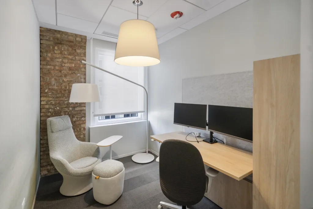
They impressed the judges with comprehensive and cohesive product and material selections based on the WELL Building Standard, a certification system designed to enhance human health and well–being in buildings, with an emphasis on soft cool tones, live plants, and lighting elements in a variety of sculptural shapes.
Their creative incorporation of existing furniture serves as a perfect example of how to execute an office refresh and will be a fantastic source of inspiration for clients who may be interested in updating their spaces without committing to a full redesign.
Behind the Design
To gain additional insights into how the designers brought their office refresh vision to life, I interviewed Alyssa and Abby to learn more about their approach.
Alex: Congratulations on winning the design contest! I looked through the vision boards you put together—you both did a beautiful job developing this concept, and it seems to be really taking on a life of its own! What was your inspiration for the look and feel of your team’s contest submission?
Alyssa: Abby put together the Miro board for the contest. Some of the topics that were at the top of our minds as we started developing the boards were the changing work environment, especially the integration of Gen Z into the workforce, and our team’s specific need for a place to collaborate and build community, both physically and digitally as our company grows and expands into new locations.
Abby: I wanted people to feel welcome and at ease as they first walk through the door, and I wanted visitors to feel a sense of calm when they come to our showroom. As a WELL AP, I also wanted to apply the knowledge I gained from my certification about the effects of elements such as textures and colors. I also wanted to emphasize sustainability, so I incorporated several products from Teknion, Studio TK, OFS, and Humanscale, since these brands take their environmental footprint very seriously, and even donated inventory from their showrooms to help us conserve resources.
Alex: I know WELL design principles were one of the main topics you discussed in your Concept Statement for your submission. What are some of the strategies you used to incorporate those principles throughout the design?
Abby: WELL emphasizes air quality and biophilia, so we brought in a lot of plants to help with air purification. We also wanted to prioritize acoustical comfort. We achieved that with ROOM privacy pods from OFS, white noise machines, and music that can be played throughout the office. Nourishment is another WELL concept, so we focused on the café area, where we added a new table and chairs to create a work café where people could take a true break for lunch and coffee. To meet the requirements of the Workplace Family and New Mother Support concept, we felt it was important to provide a dedicated place for nursing moms to comfortably pump milk. In the Mother’s Room we selected the Sofy chair by OFS, because it is comfortable but provides a very upright sit, which is a must when using a pump machine. Movement is another aspect of WELL that we kept in mind, so to empower people to be more active throughout their workday, we provided height-adjustable HiSpace desks from Teknion and offered variety in the spaces throughout the office to encourage people to get up and move to different zones throughout the day.
Alex: I understand that working with the existing space and finding ways to repurpose existing furniture is a key element of an office refresh that differentiates a refresh from a full-on redesign. Can you tell me about how you identified which existing furniture items you wanted to keep and incorporate into your design?
Alyssa and Abby: We focused on what was still serving end users and what wasn’t. We kept some areas of the original layout that were functional and comfortable, and made changes to the areas where the existing furniture wasn’t supportive for long periods of use. We also reworked underutilized areas, like turning a private office that was rarely used into a dedicated space for virtual meetings.
Alex: How was your thought process for specifying new furniture in the refresh different from how you might approach selecting furniture in a project with all-new products?
Alyssa: You have to consider cost and impact in both situations, but with an office refresh, there’s often a long wish list and a smaller budget. We had to make thoughtful decisions about what investments would make the biggest impact. For us, sit-to-stand workstations and improved technology were key focus areas, along with acoustics (phone booths and baffles). We also had to evaluate the existing ‘real estate’ to see where there were opportunities for additional meeting spaces, which isn’t something we’d need to do with a new build. This refresh really challenged us to be more creative.
Alex: You mentioned that improving technology throughout the office was one of your top priorities for this project, how did you go about solving for that?
Alyssa and Abby: We prioritized technology at the workstations by installing Humanscale M/Flex monitor arms that double as docking stations. Since different roles within our organization use different types of computers, it used to be really challenging for people to find a desk with a docking setup that was compatible with their particular model of computer, especially on days where the office was busier, and seats were limited. Now that we have the M/Flex stations, the project managers and project coordinators can work from any desk, which has helped significantly with making it easier for everyone to find somewhere to sit.
We also added Humanscale Nova task lights at the desks on the North side, since that part of the office doesn’t get as much natural light. These task lights feature some cool technology like oscillating heads, motion sensors to conserve energy, and they can even be used as ring lights to help people look their best on calls. We gave a lot of thought to how people would appear virtually, since so much of our industry is hybrid.
Another way we designed the space to help us put our best foot forward on calls was by considering backgrounds. We chose abstract watercolor-inspired wallpapers for our video call rooms so that people would have a flattering and professional background in calls when their cameras are on.
We also worked with our IT team to create consistency throughout meeting rooms, so that every meeting room has the same AV setup. Now we can use smaller meeting rooms as overflow rooms for large company-wide meetings where not everyone can fit in at one table, so people can break up into small groups and all join the same call.
Alex: What are some of your favorite details in the design? I’d love to hear about any elements that might not be obvious to a casual observer that you’d like to bring attention to!
Abby: I love the plants and the soothing color palette we used. I applied my knowledge of color theory, and knowing people are influenced by the colors around them on a subliminal level, we selected the palette strategically because we specifically wanted the office to have a soothing effect and boost creativity, which blues and greens have been shown to promote. This also ties in with the Mind principle of WELL, which in summary is that the design choices made in a space should optimize the cognitive and emotional health of the occupants.
I was also really excited to include the Cityline A Frame by Teknion, it’s a really cool product. Teknion is big on material transparency, and Cityline supports the credit a. Declare label and VOC restrictions. It also has planters for more live greenery, which is a fun feature!
Alyssa: The tactile experience stands out to me—the upgraded textiles really elevate the space. Since WELL goes hand in hand with sustainability, we incorporated fully biodegradable fabrics from Luum. On the workstations, we replaced white laminate with a woodgrain finish for warmth. The seating in the meeting rooms is a huge upgrade too. The Studio TK Jima chairs, upholstered in Luum Touchtone, are incredibly soft—like butter. We also have a bold-patterned fabric on the Studio TK Clique bench in one of the meeting rooms that adds a fun touch.
Alex: What aspects of the finished design are you most excited to see installed once the entire refresh is completed?
Abby: I’m excited for the baffles. They’ll help soften the space and further define the community area. Having that lower shield above people will make the enclosed space feel more cozy.
Alyssa: I’m looking forward to making the space feel more like a destination. We’re adding Teknion Banqs banquettes in the kitchen, and we’re waiting on a custom table. Once that’s in place, it will feel even better. We’ve already gotten compliments from visitors who love how inviting the space is. A designer recently commented on how nice it is to see us applying the recommendations we give our clients to our own office.
Alyssa and Abby: We’re both also really happy with how the meeting rooms turned out. The OFS Kasura chairs in the boardroom have a nice scale to them and are really comfortable for longer meetings. Alyssa especially loves the meeting room that was formerly a private office. We re-used a Studio TK Dual chair with a Cesto ottoman in that room. Alyssa loves to work in there so she can put her feet up on the ottoman and turn on the little lamp for a quieter and homier atmosphere.
Alex: Lastly, what advice would you give a client—or even a designer—approaching an office refresh project for the first time?
Alyssa and Abby: Even with a small budget, you can make a big impact. Changes like paint can make a huge difference. The workplace is always in a state of change, especially now, so don’t be afraid to experiment with new products and applications. Identify your top three priorities for the refresh and let those guide your decisions. Also, leverage your dealer and manufacturer relationships to increase your purchasing power.
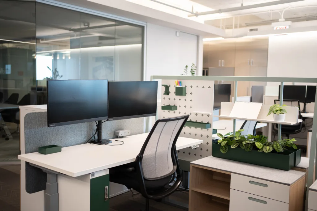
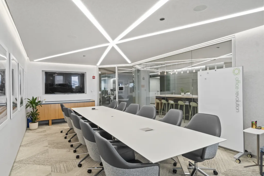
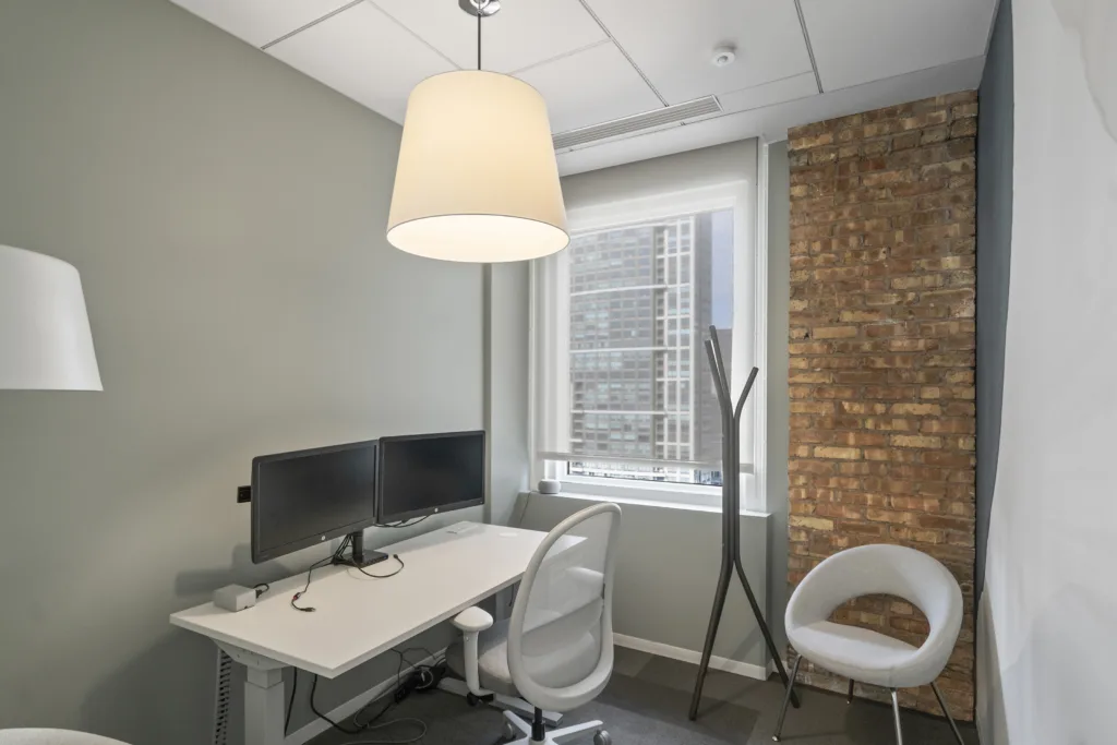
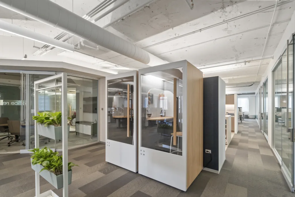

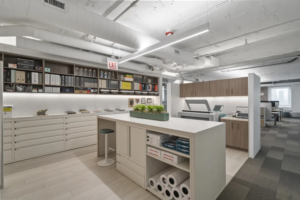
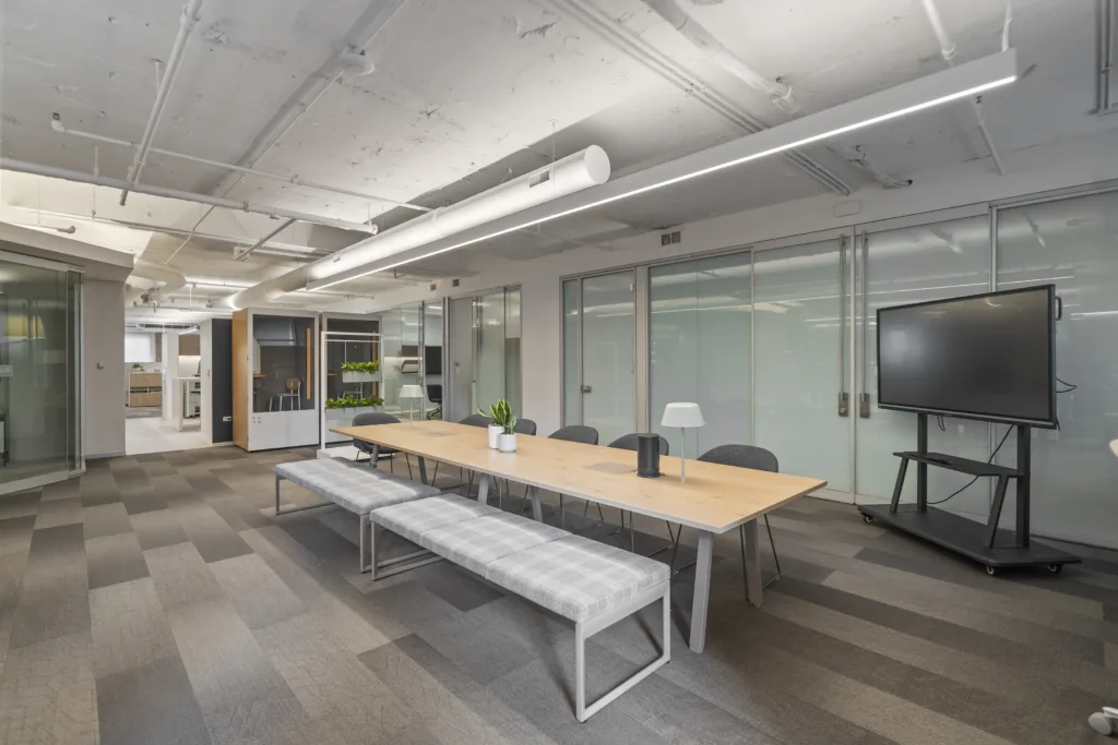
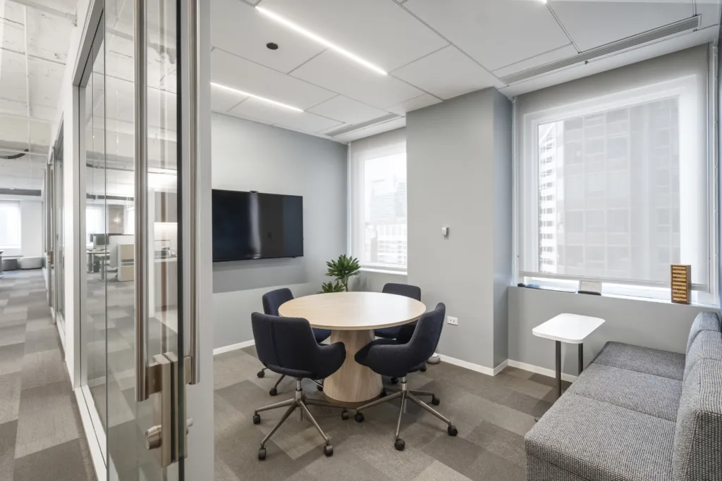

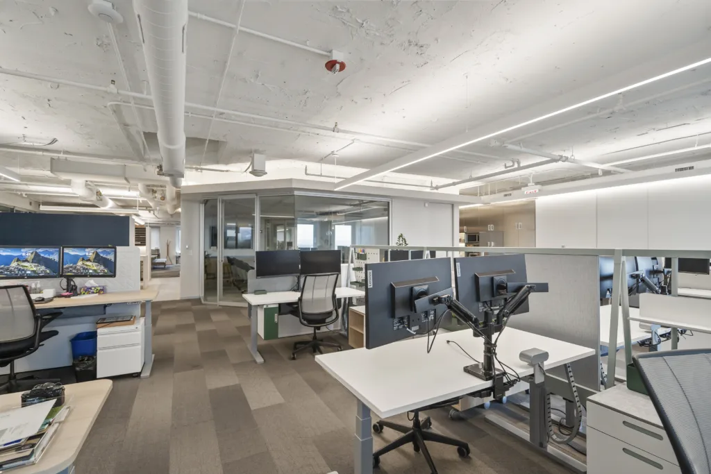
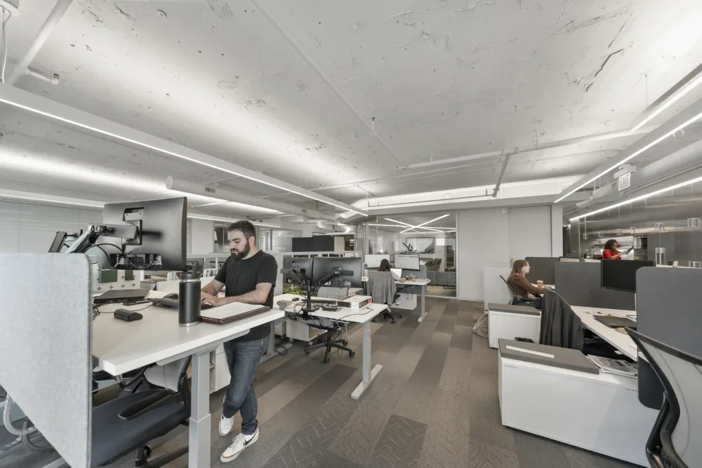
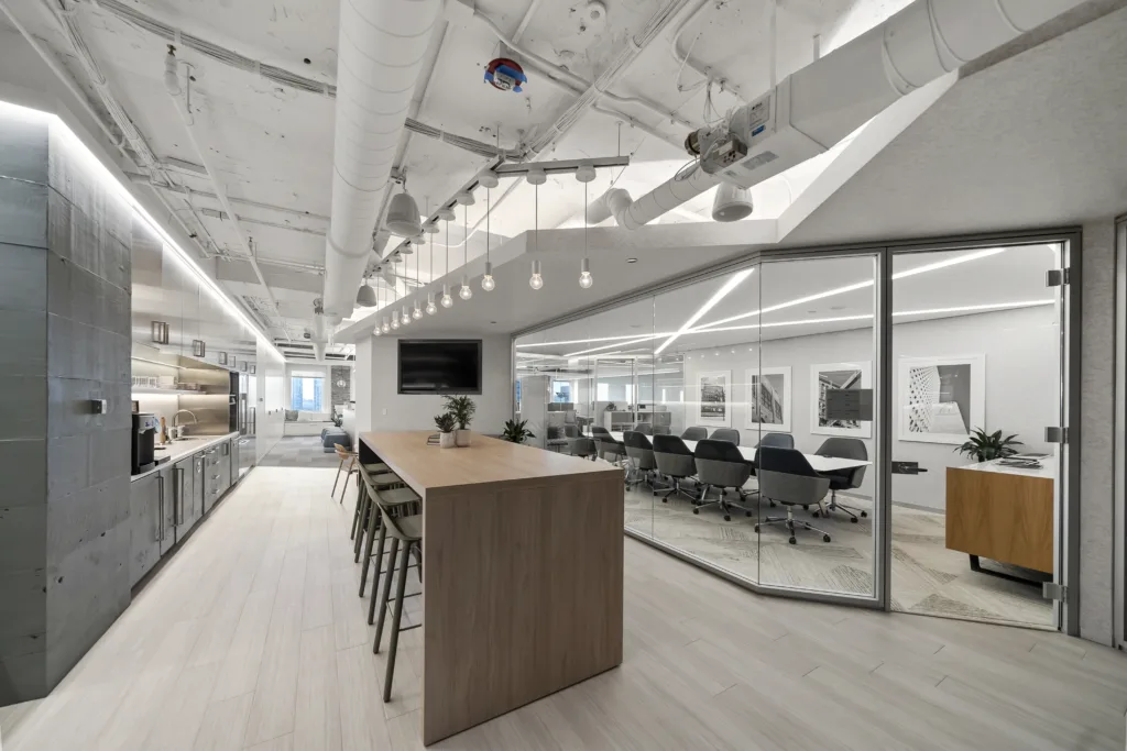

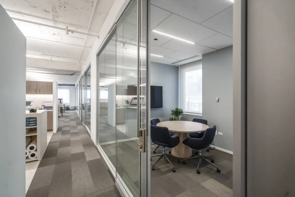
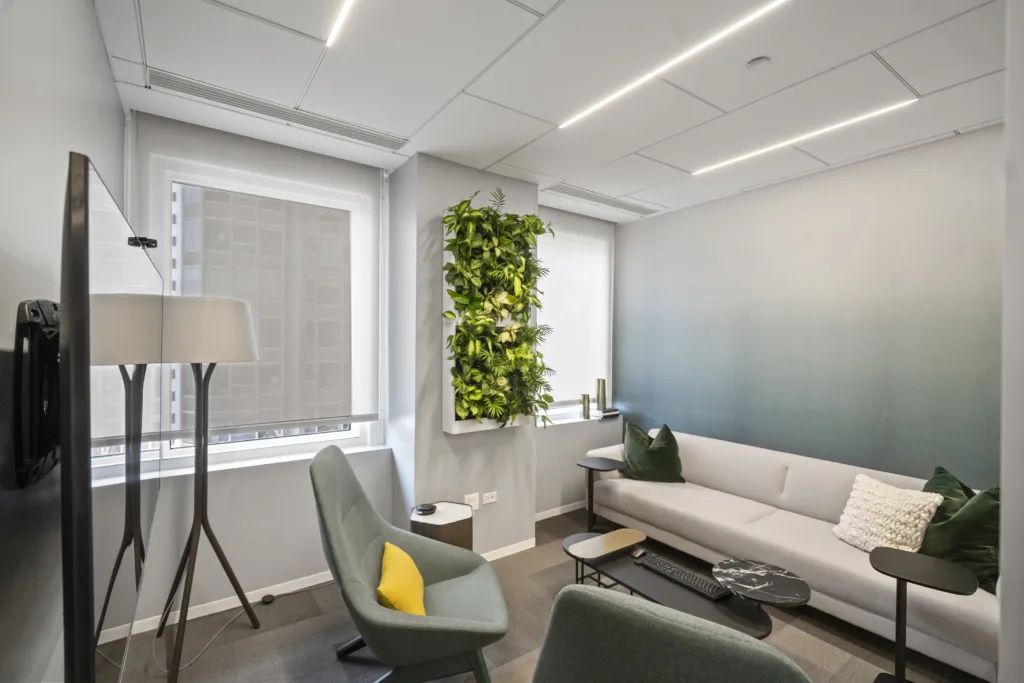
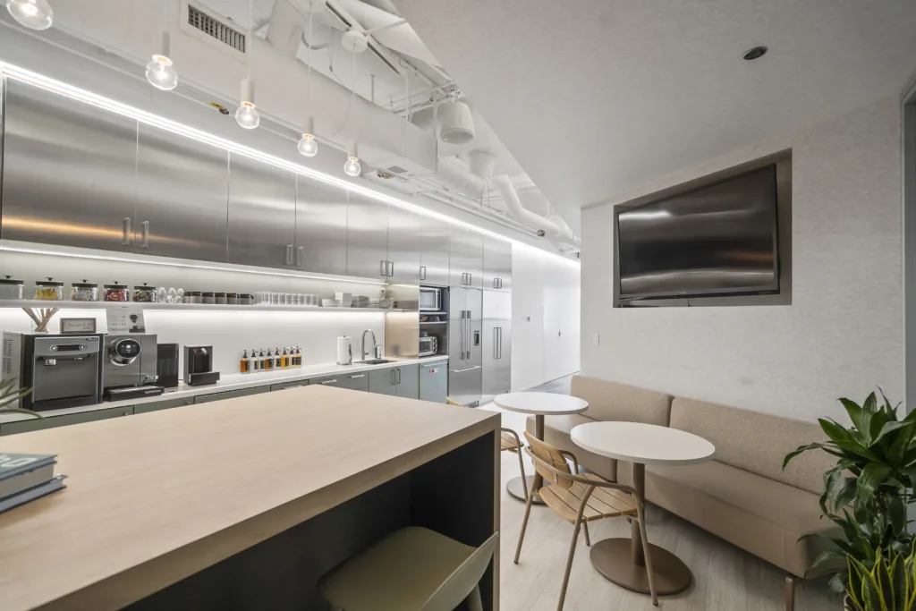
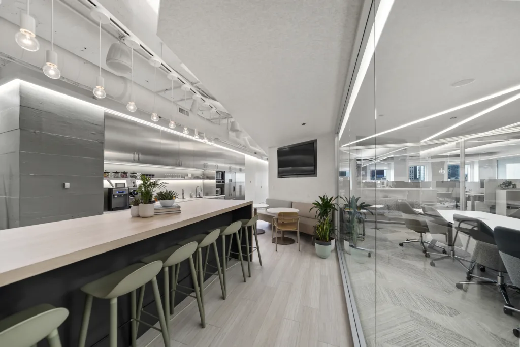

Alyssa Ludwig and Abby Boeheim’s winning design for the Office Revolution showroom exemplifies how thoughtful, strategic choices can transform a workspace within budgetary constraints. By prioritizing sustainability, wellness, and flexibility, their office refresh approach delivers a workspace that fosters collaboration, creativity, and well-being.
This experience demonstrates that even subtle changes can make a significant impact, offering valuable insights for both designers and clients looking to revitalize their spaces. As we look forward to seeing their design fully implemented, it’s clear that their innovative approach will continue to inspire others in creating dynamic and mindful work environments.
Contributors

Alex Lang
Alex Lang joined the Office Revolution team in 2021 after graduating with honors from Bowling Green State University, where she earned a degree in Interior Design and a minor in Marketing.
With over four years of industry experience, Alex brings a deep understanding of design principles and a well-rounded expertise to her role. As a dedicated writer with a passion for continuous learning, Alex is particularly focused on the evolving trends and research shaping the future of commercial interiors.
In her role as Content Strategist, Alex leverages her design background and marketing insight to craft compelling client deliverables, develop internal resources, and contribute as a guest author on industry-related topics.

Alyssa Ludwig
Alyssa Ludwig is a knowledgeable and experienced designer with over 10 years in the industry. As half of the team that won the office refresh design contest, her creative vision and attention to detail were key to the project’s success.
For the past 6 years, Alyssa has been an integral part of our dealership, bringing her expertise in flooring, upholstery, and furniture. At Office Revolution, she supports The Telos Group, collaborating with real estate, A&D, and end users to design and furnish complete office spaces. Her extensive knowledge of manufacturer offerings and product solutions makes her a valuable asset.
Alyssa is also proud of her work on the reimagining of Chicago’s historic Old Post Office, having completed four projects there and counting.
Abby Boeheim
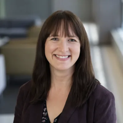
Abby Boeheim is a talented and creative interior designer with 14 years of experience in the commercial office furniture industry. As a WELL Accredited Professional, she is passionate about incorporating health and wellness principles into every design.
She was a key member of the winning team in our design contest, showcasing her ability to deliver innovative, wellness-focused solutions. On projects, Abby provides comprehensive design services, including space planning, furniture specifications, renderings, and finish selections expertly tailored to her client’s needs.
Abby looks forward to continuing to integrate wellness strategies into all her projects, creating spaces that inspire and support human well-being.


